Vibra Academy
One learning journey for a medical academy: site, platform and iPhone app
- Company
- Vibra Academy
- Role
- Product designer and developer
- Timeline
- May–September 2026
- Status
- Site and platform live · iPhone in TestFlight
- Site
- vibra.academy
- Product spec
- Design system
- Web platform
- iOS
- Website




Results
The project
Vibra Academy is a medical education and mentorship company in São Paulo, and its students are licensed physicians. I designed and built three products for it, alone with AI agents, from the product spec to the back end, on the academy’s navy and gold brand.
The problem
The physicians were enrolled in cohorts, each with a mentor, but the program lived in many places at once: video call links, WhatsApp groups, shared PDFs and spreadsheets. Students, mentors and the academy’s team each felt it in a different way.
- 01Students had no single place to resume a lesson, on the laptop or on the phone.See how it was solved
- 02Lessons came as slide files and PDFs, and the one web deck opened with a shared password.See how it was solved
- 03Mentors answered questions in chat threads, with nowhere to keep the files or the follow-up tasks.See how it was solved
- 04The team kept cohorts, enrollments and materials in spreadsheets and shared drives.See how it was solved
- 05Physicians met at in-person events needed a quick way to try a lesson before enrolling.See how it was solved
How I solved it
One answer per pain. The platform screens come from a local copy filled with invented students, mentors and lessons; the iPhone screens use the app’s own sample data.
01
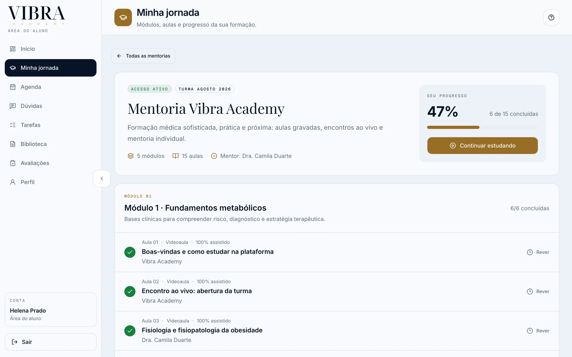
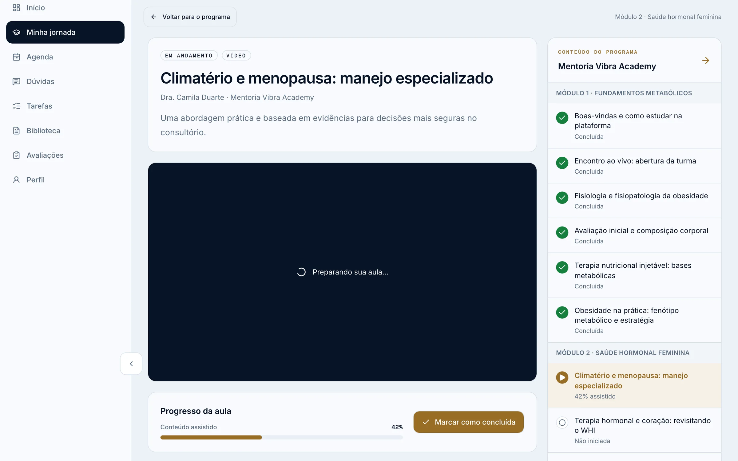
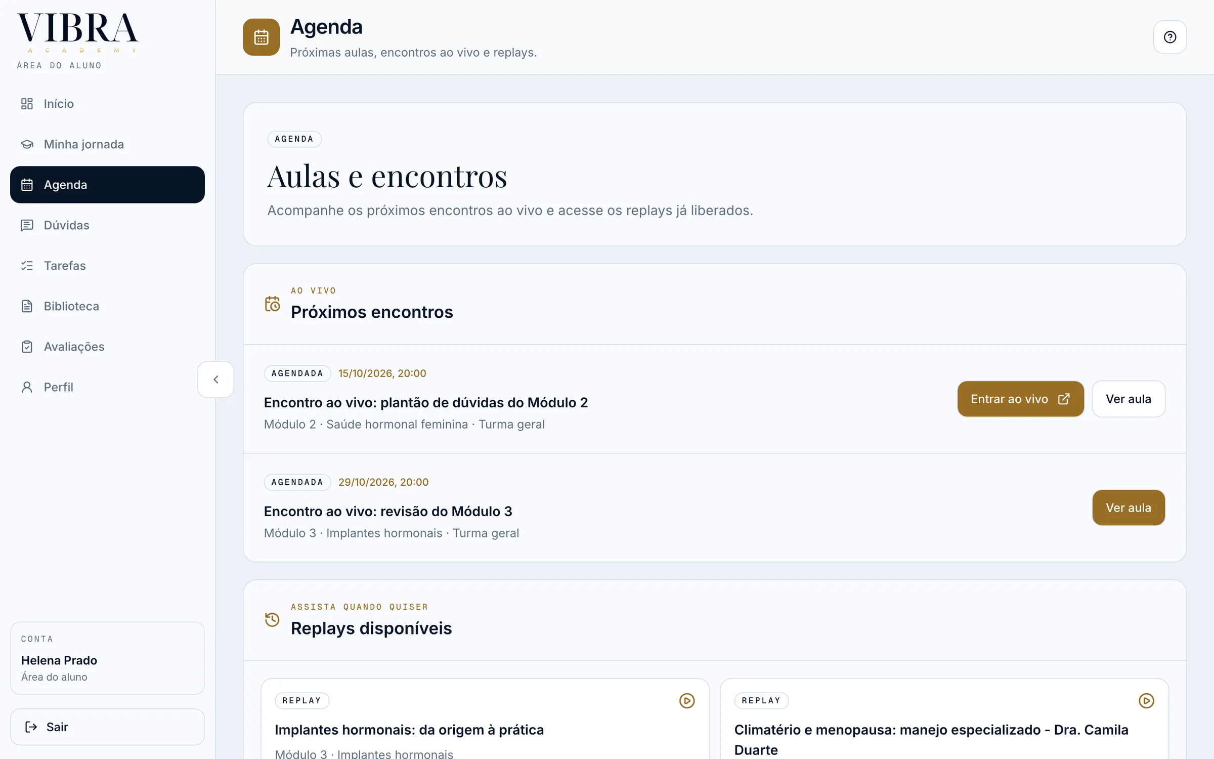
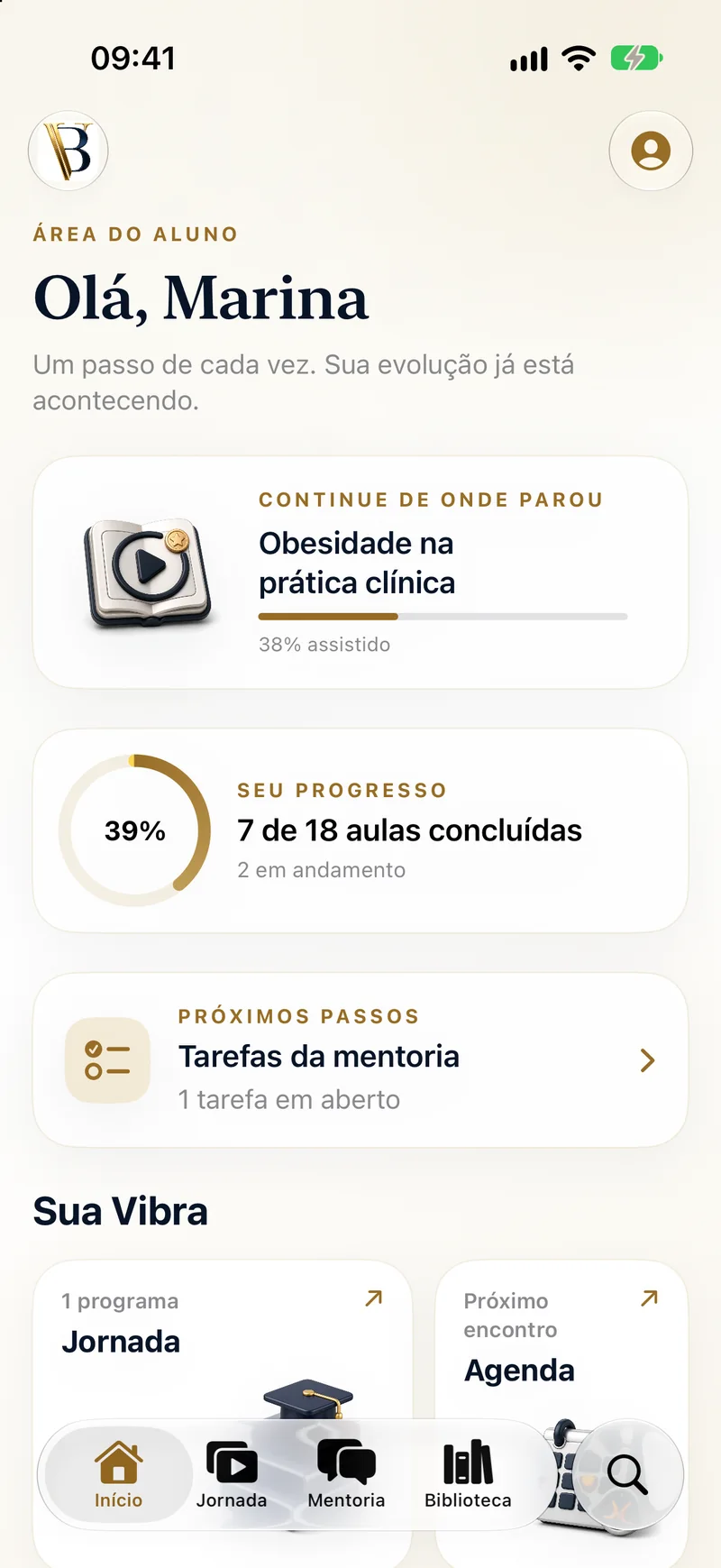
One place to pick up the next lesson, on the web or the iPhone
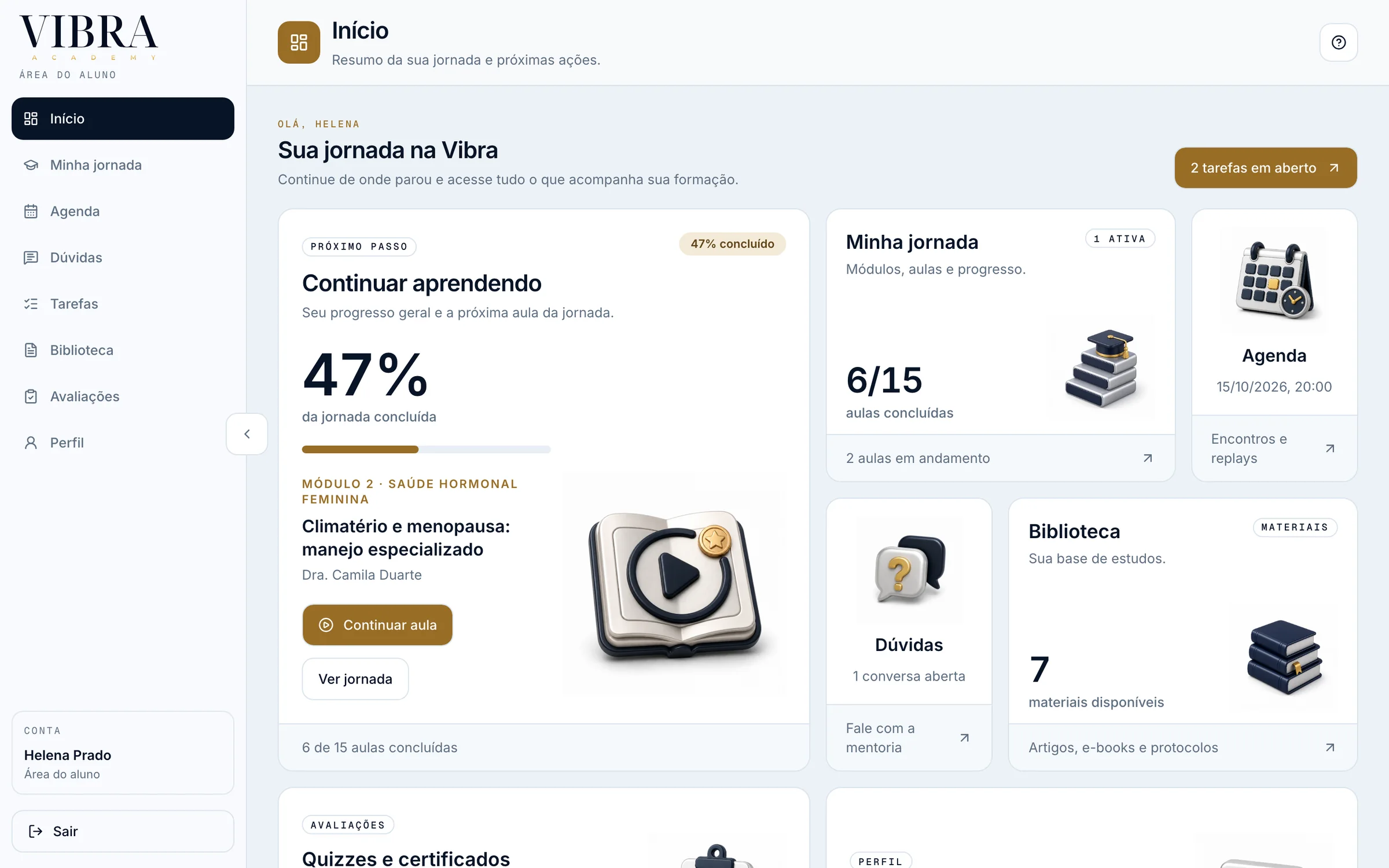
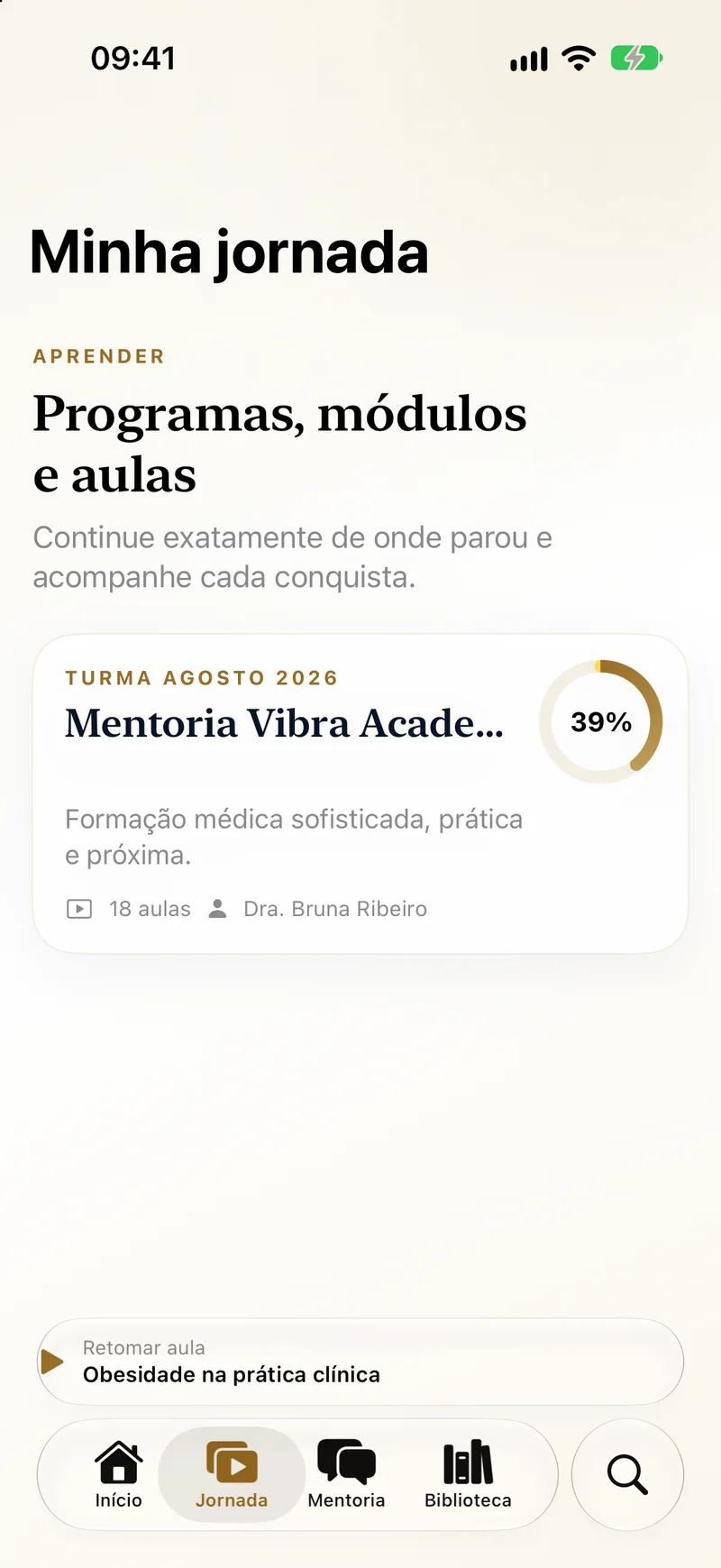
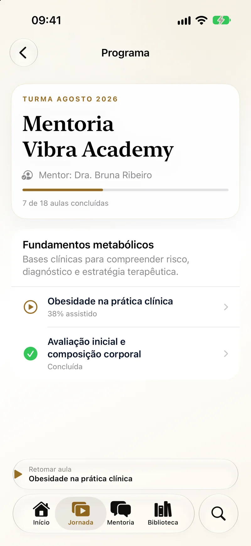
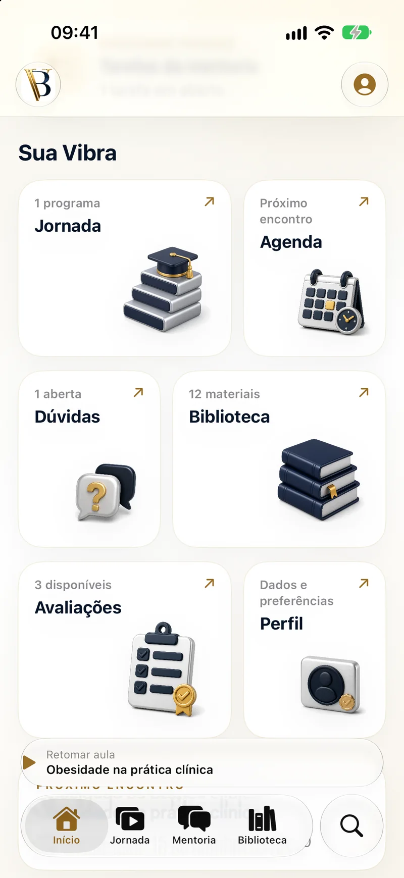
What do I do now?
Both open on the lesson to resume and the progress of the whole program, then the next steps: live sessions, questions and tasks.
02
Every lesson in the browser, opened by enrollment
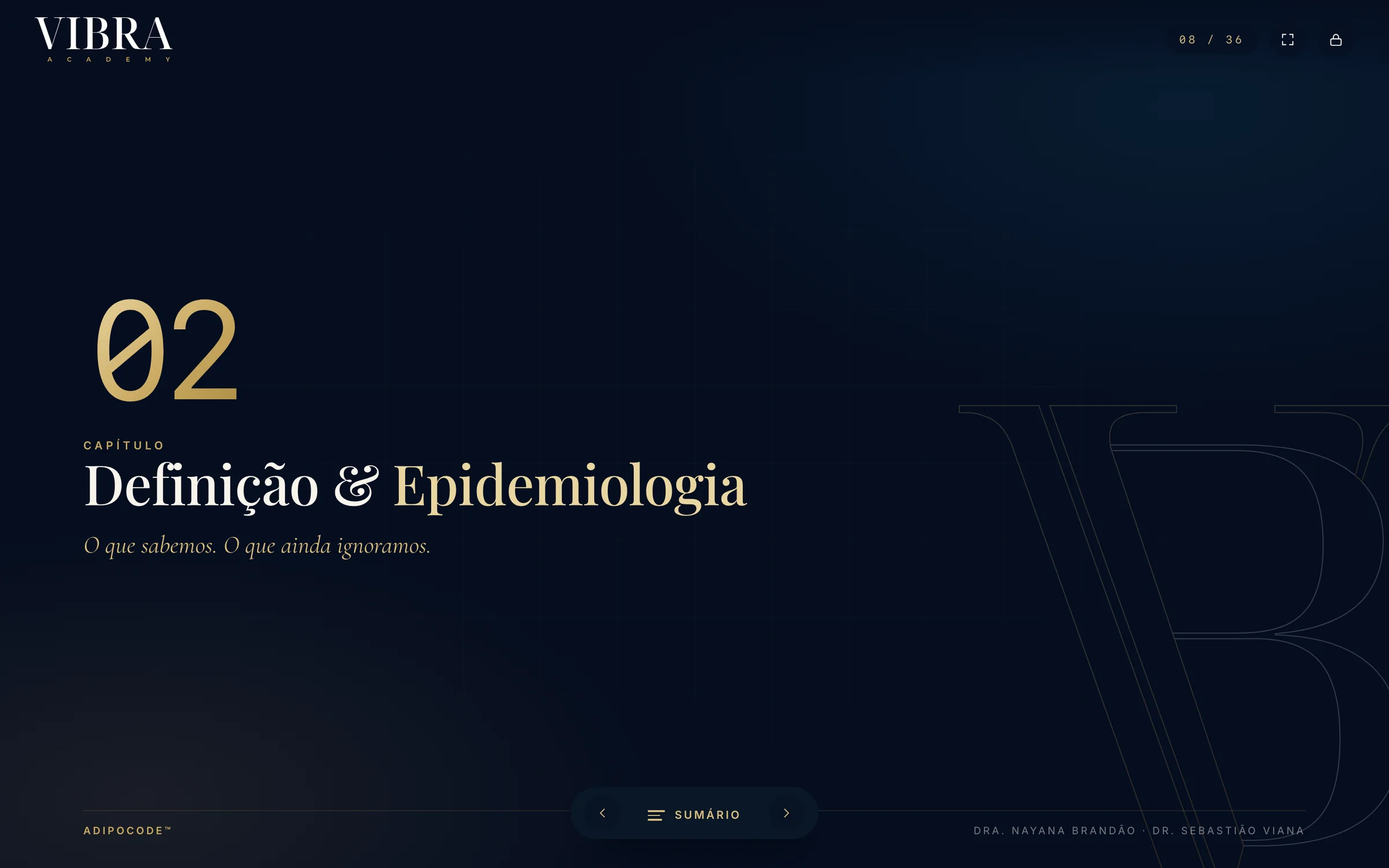
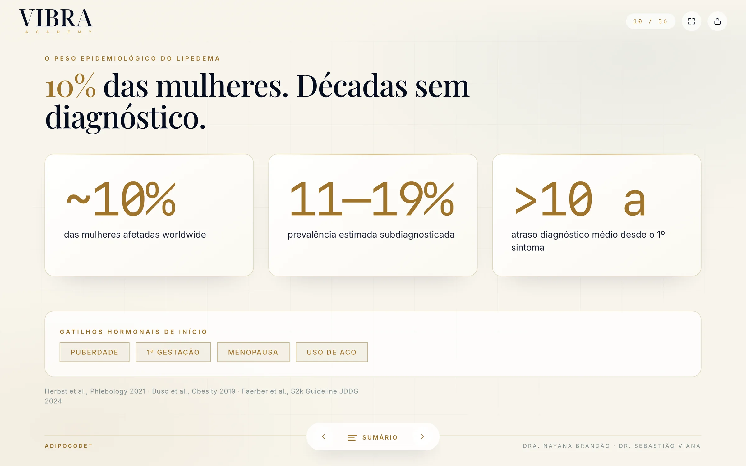
A chapter slide
Navy, the chapter number in mono and the VB watermark, with the deck’s counter and contents always one tap away.
418
pages in 9 slide decks and 1 PDF
449
web slides, in 12 lesson manifests
2
recorded lessons, 1h18m and 1h08m long
40
web slides from each recording
602
slides across 16 decks on one static deck engine, with the rest of the catalog. Each lesson is a typed manifest, so a new lesson is a data file, not a new deck.
03
Questions in a queue, not a chat thread
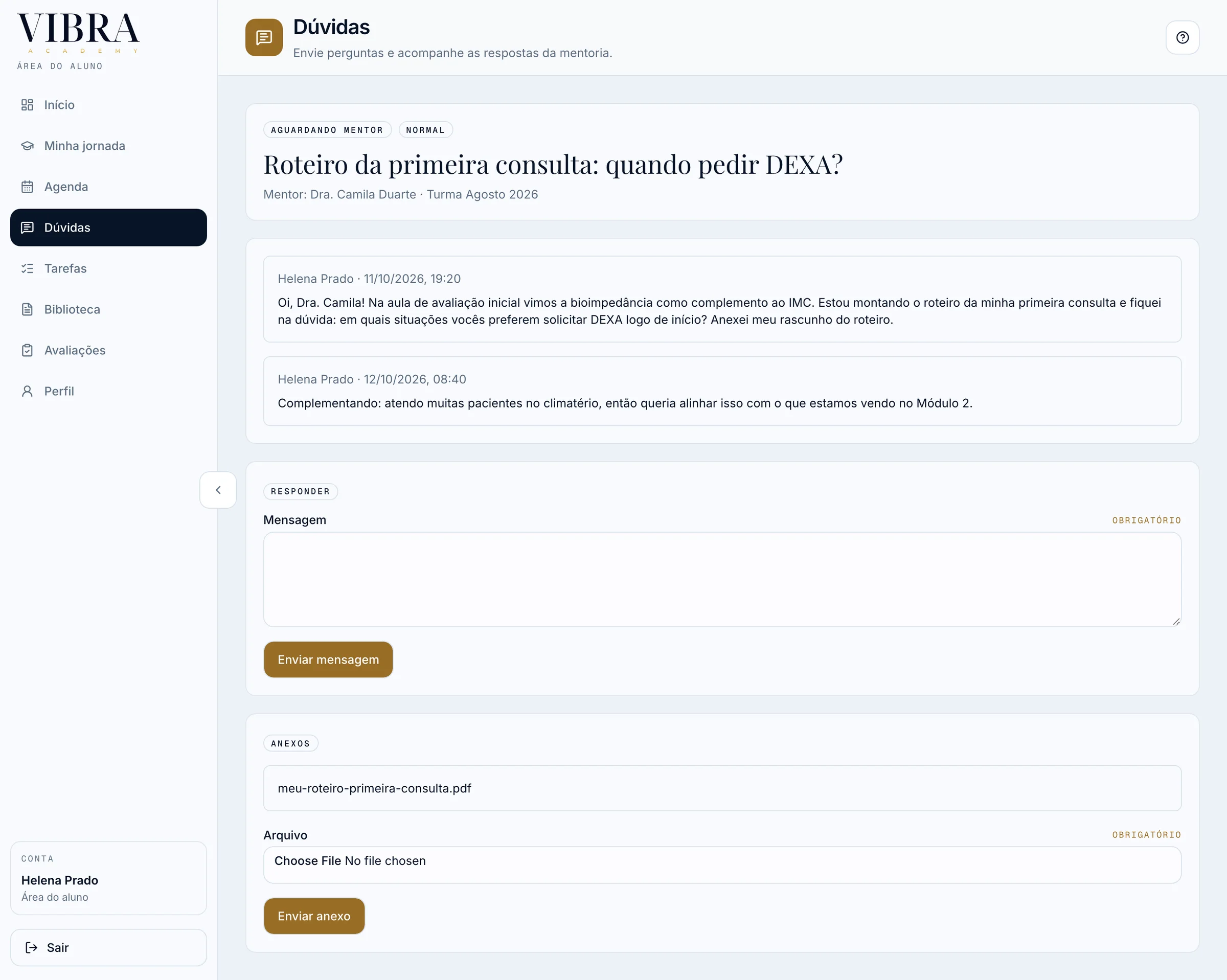
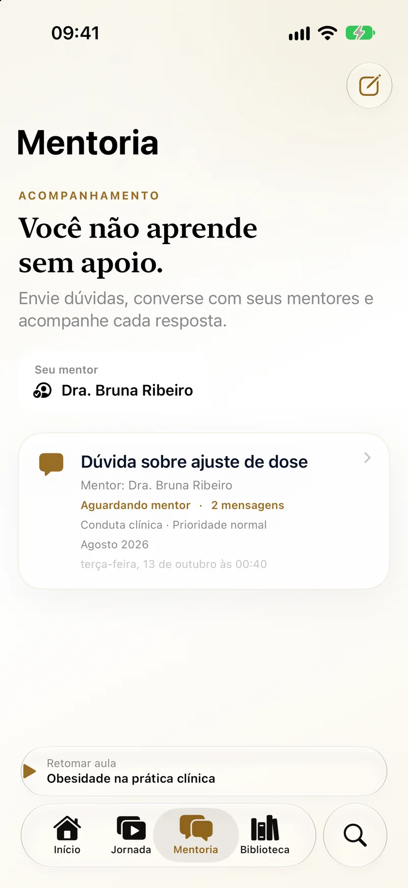
- 01 / 03Student
A question, by subject
The student asks on the web or the iPhone, attaches a file, and follows one thread with every answer.
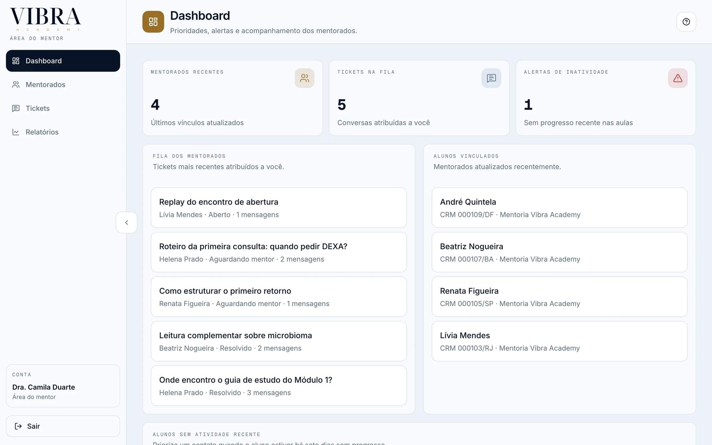
- 02 / 03Mentor
It lands in the mentor’s queue
Mentors work from a queue next to their mentees, with an alert for mentees who have gone quiet, and get notified on WhatsApp.
- 03 / 03Mentor
An answer, and a note only the team sees
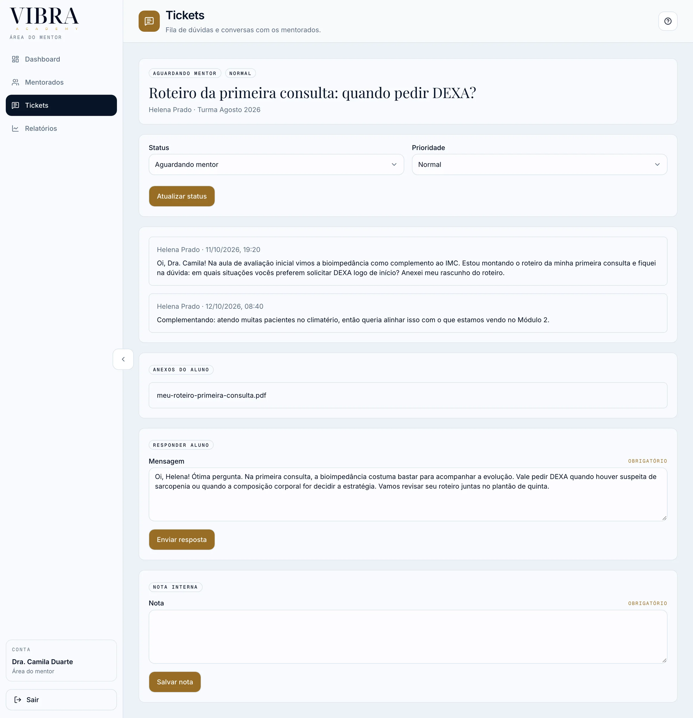
The mentor sets status and priority, replies in the thread, and keeps an internal note the student never sees.
- 01 / 03Student
A question, by subject
The student asks on the web or the iPhone, attaches a file, and follows one thread with every answer.
- 02 / 03Mentor
It lands in the mentor’s queue
Mentors work from a queue next to their mentees, with an alert for mentees who have gone quiet, and get notified on WhatsApp.
- 03 / 03Mentor
An answer, and a note only the team sees
The mentor sets status and priority, replies in the thread, and keeps an internal note the student never sees.
04
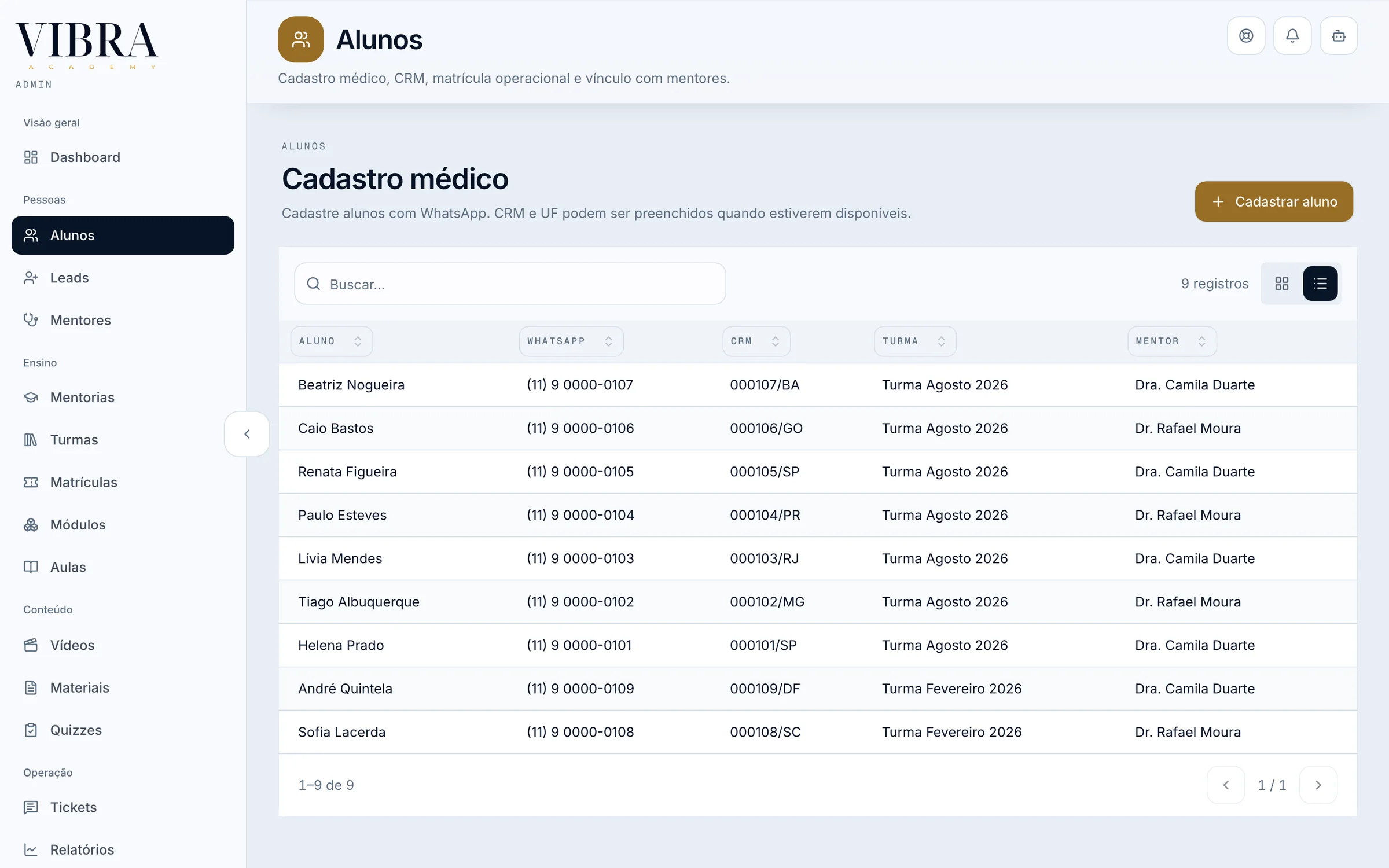
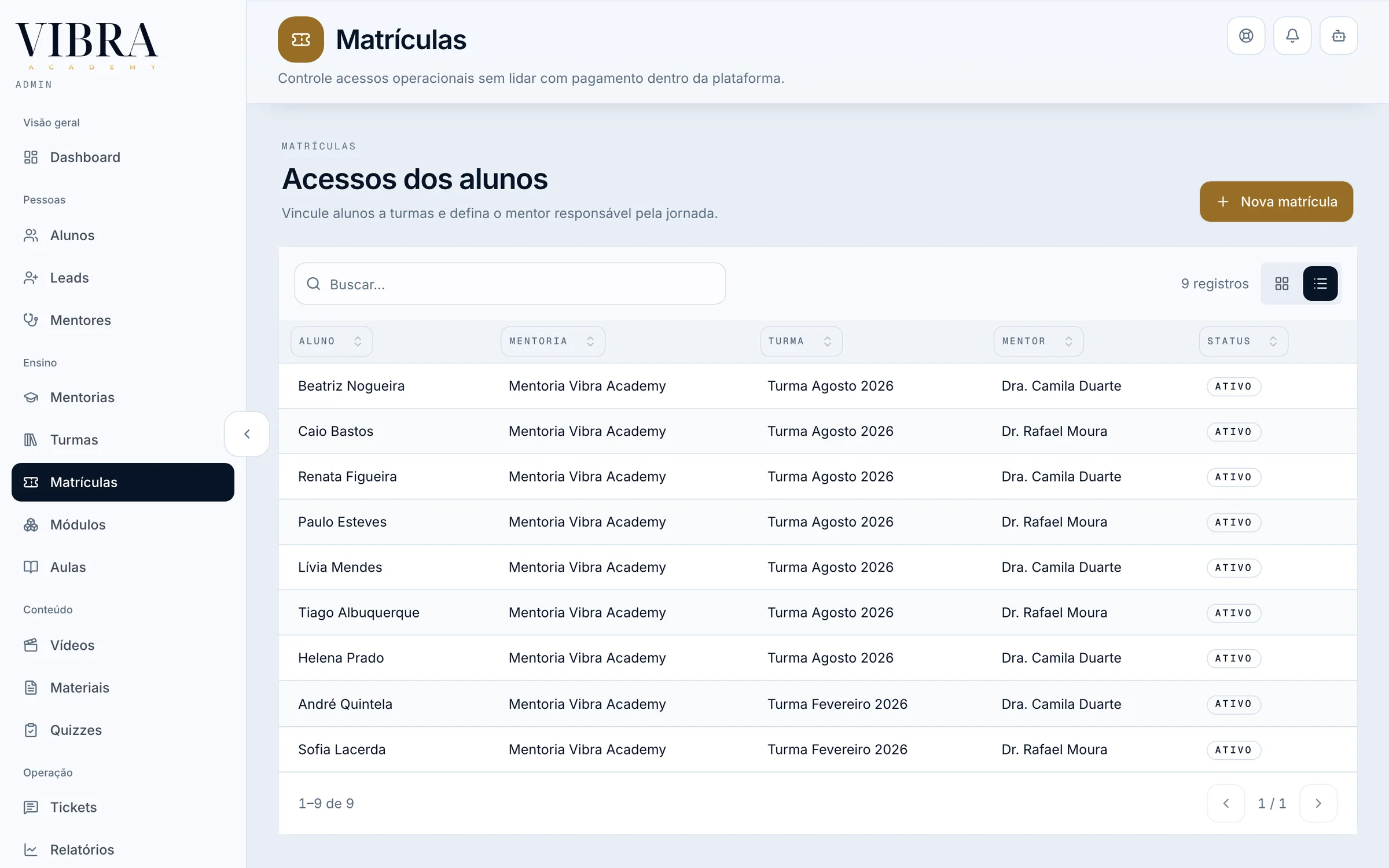
The team runs cohorts, lessons and video from one admin
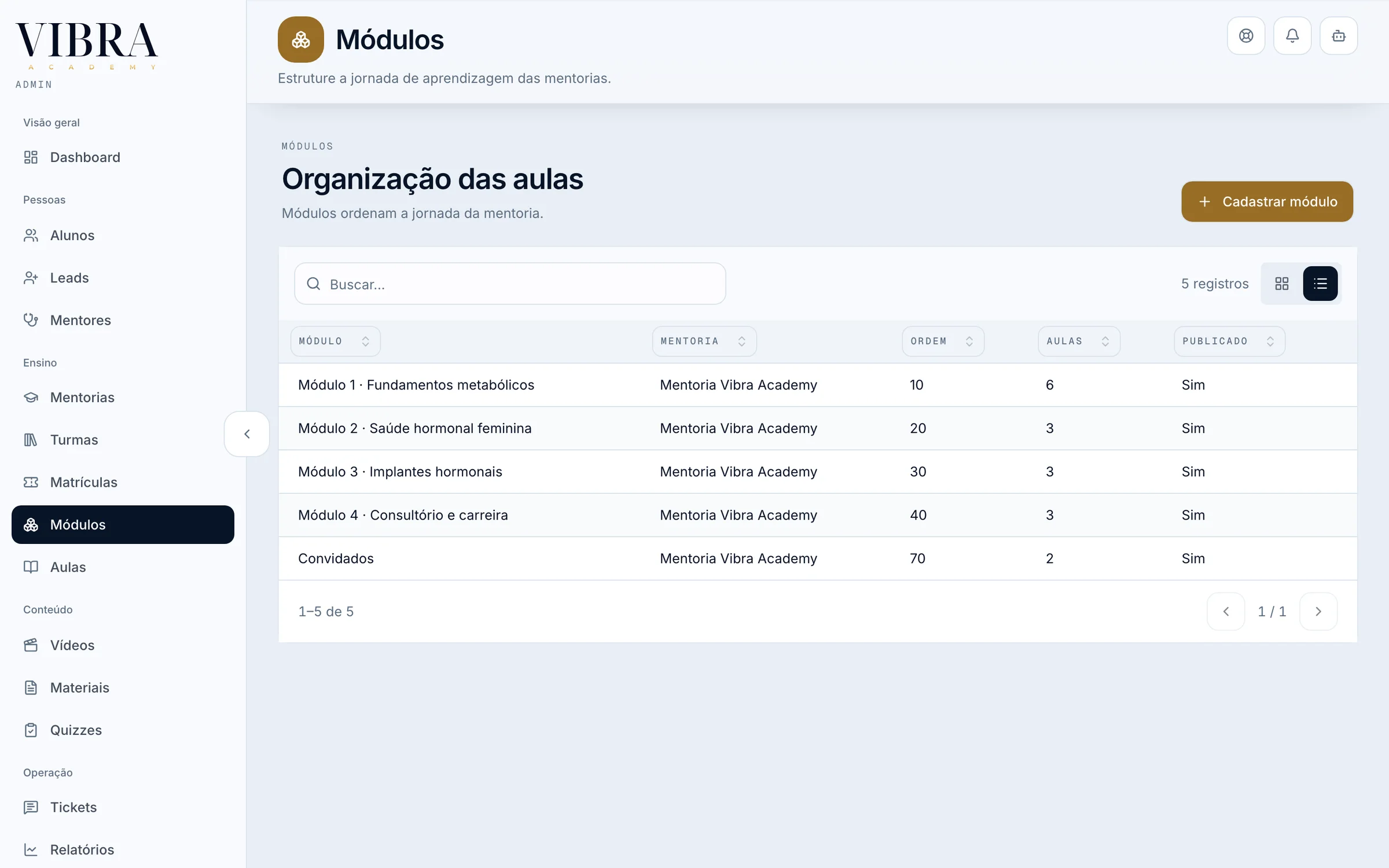
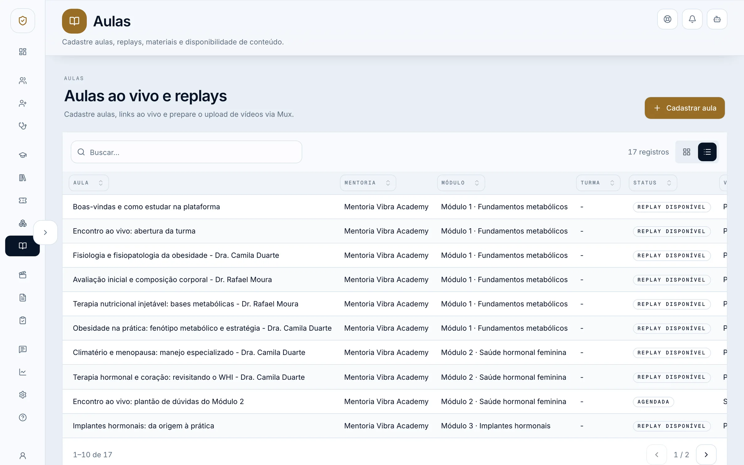
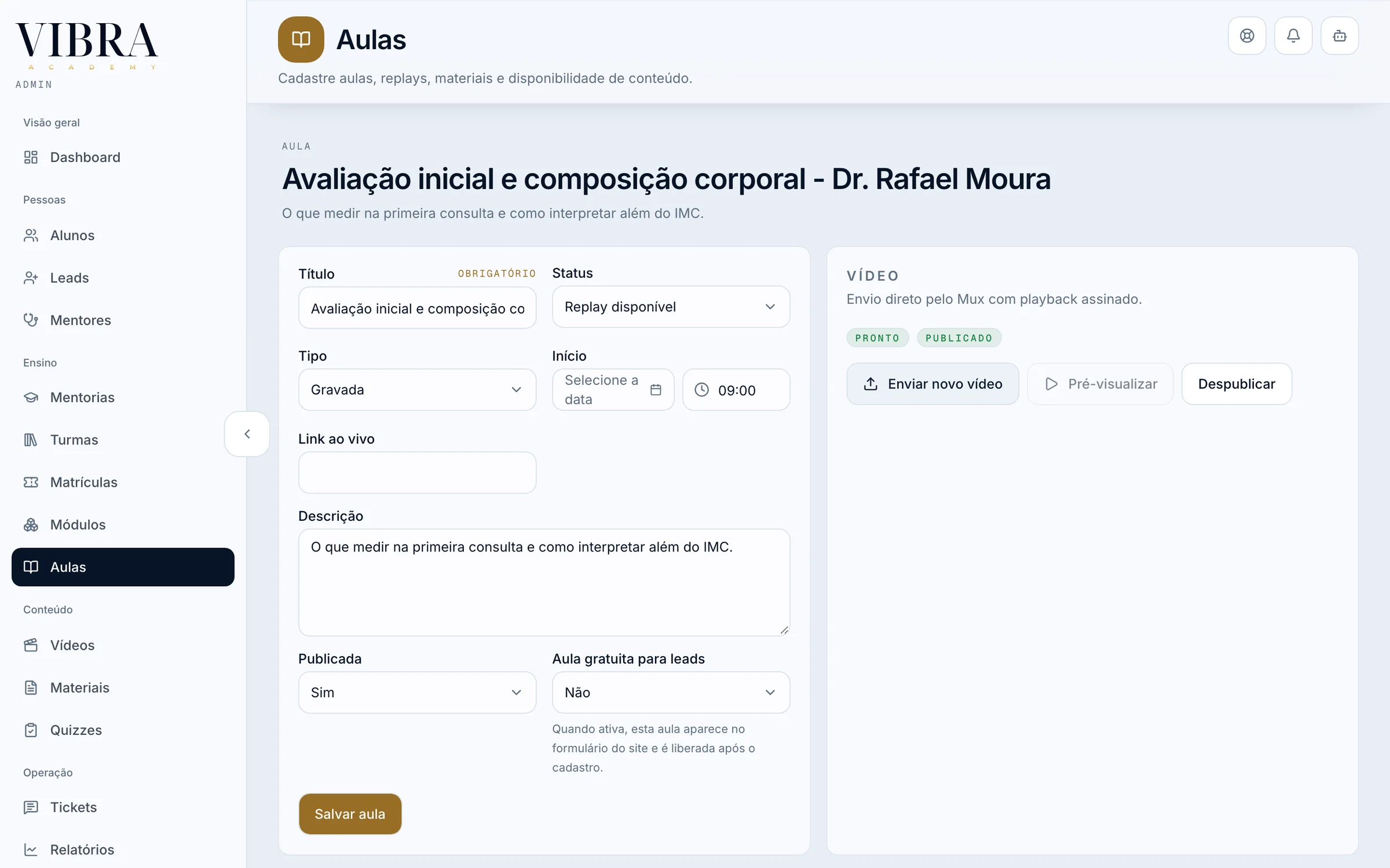
Dashboard
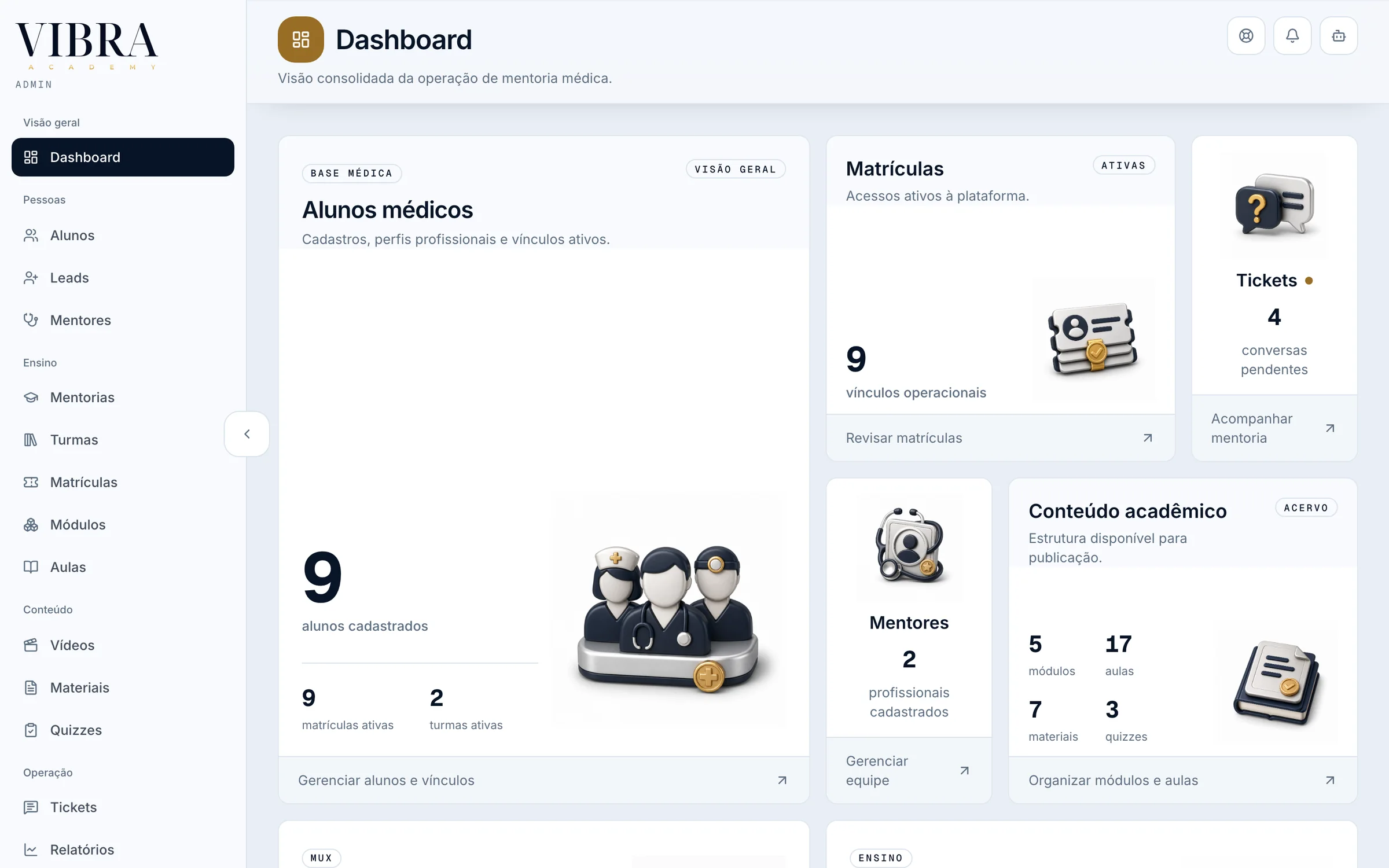
Every area on one board, each with its 3D icon. The counts come from the local copy’s invented data.
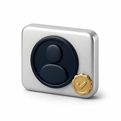
Thirteen 3D icons, one spec
Each area has an icon from a set I made to one camera, light and material spec, so the admin, the student area and the iPhone app read as one product.
For students7
 Journey
 Continue
 Agenda
 Library
 Questions
 Evaluations
 Profile
For staff6
 Students
 Mentors
 Enrollments
 Tickets
 Videos
 Content
05
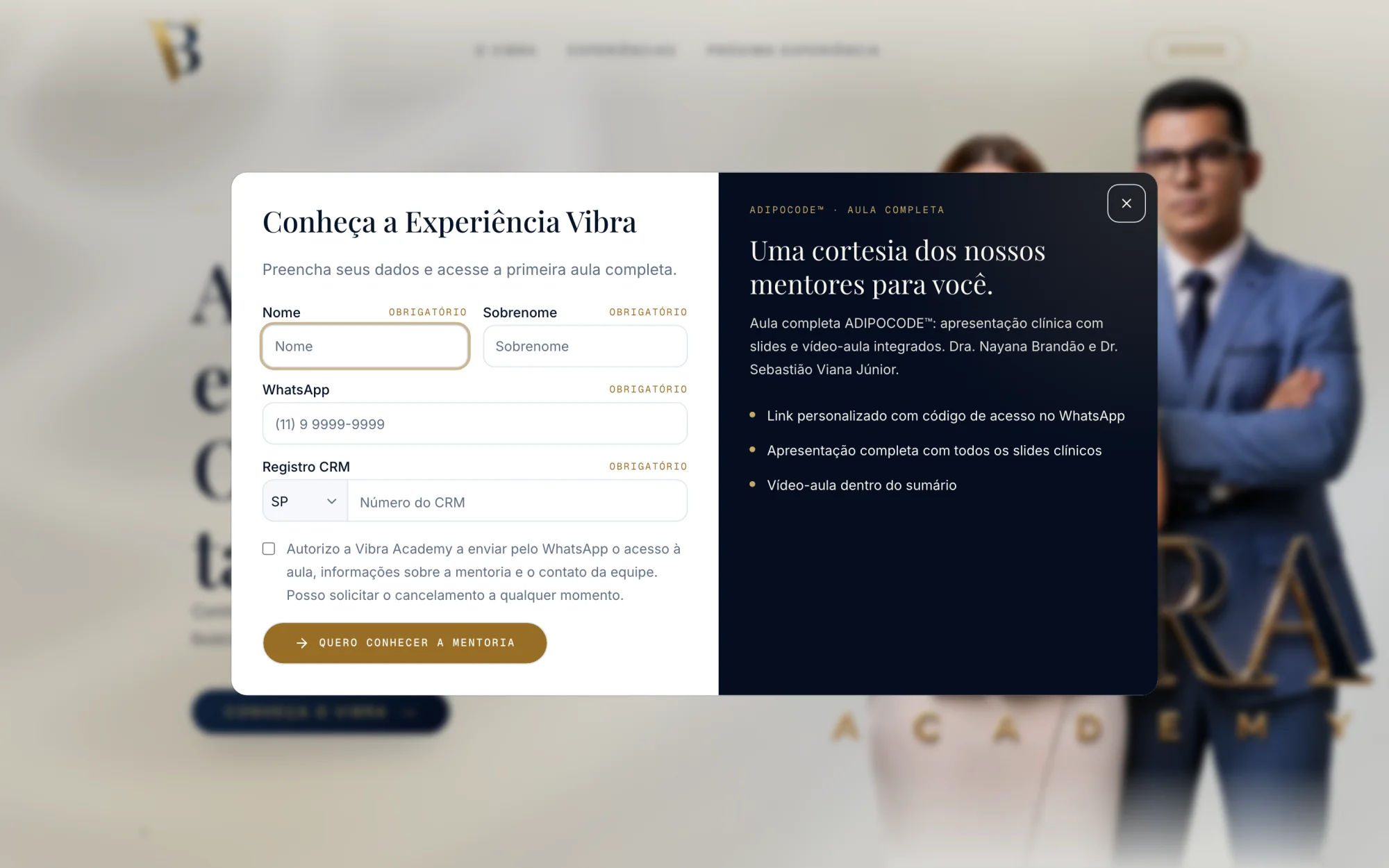
From an event QR code to a free lesson
On the site, or at the event
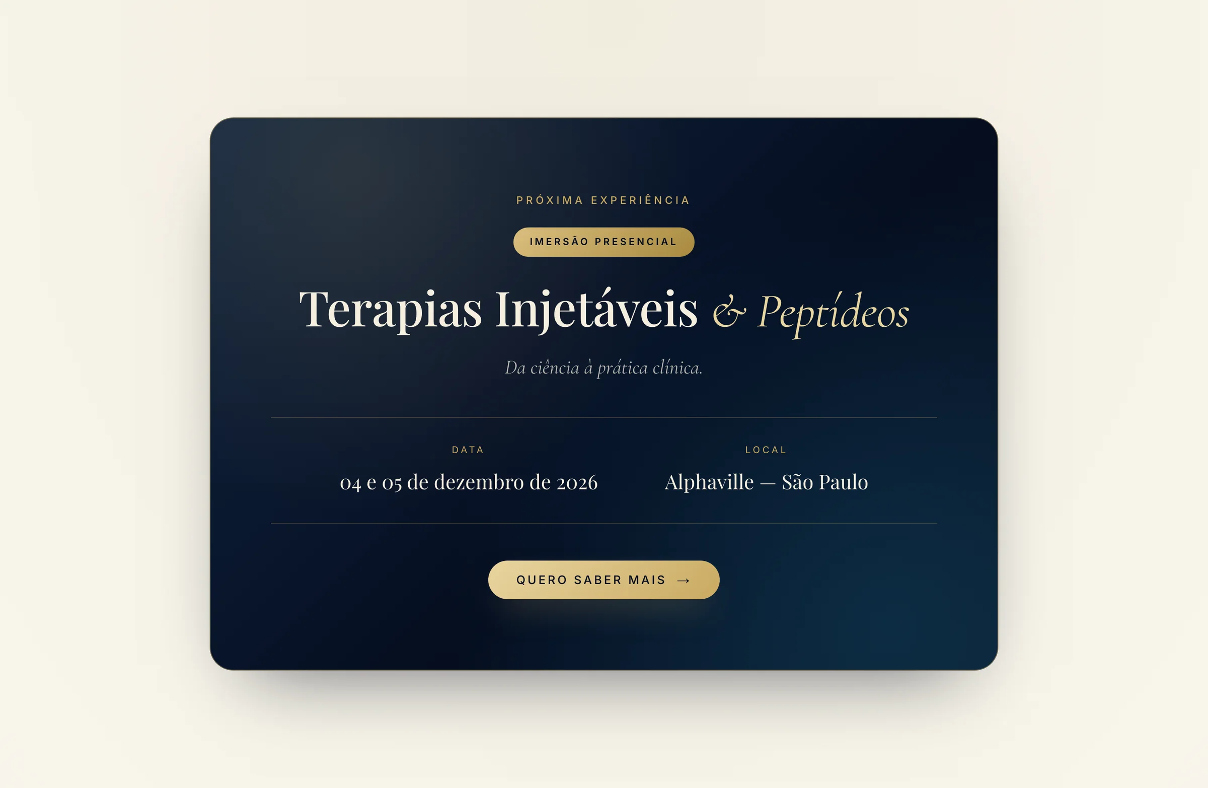
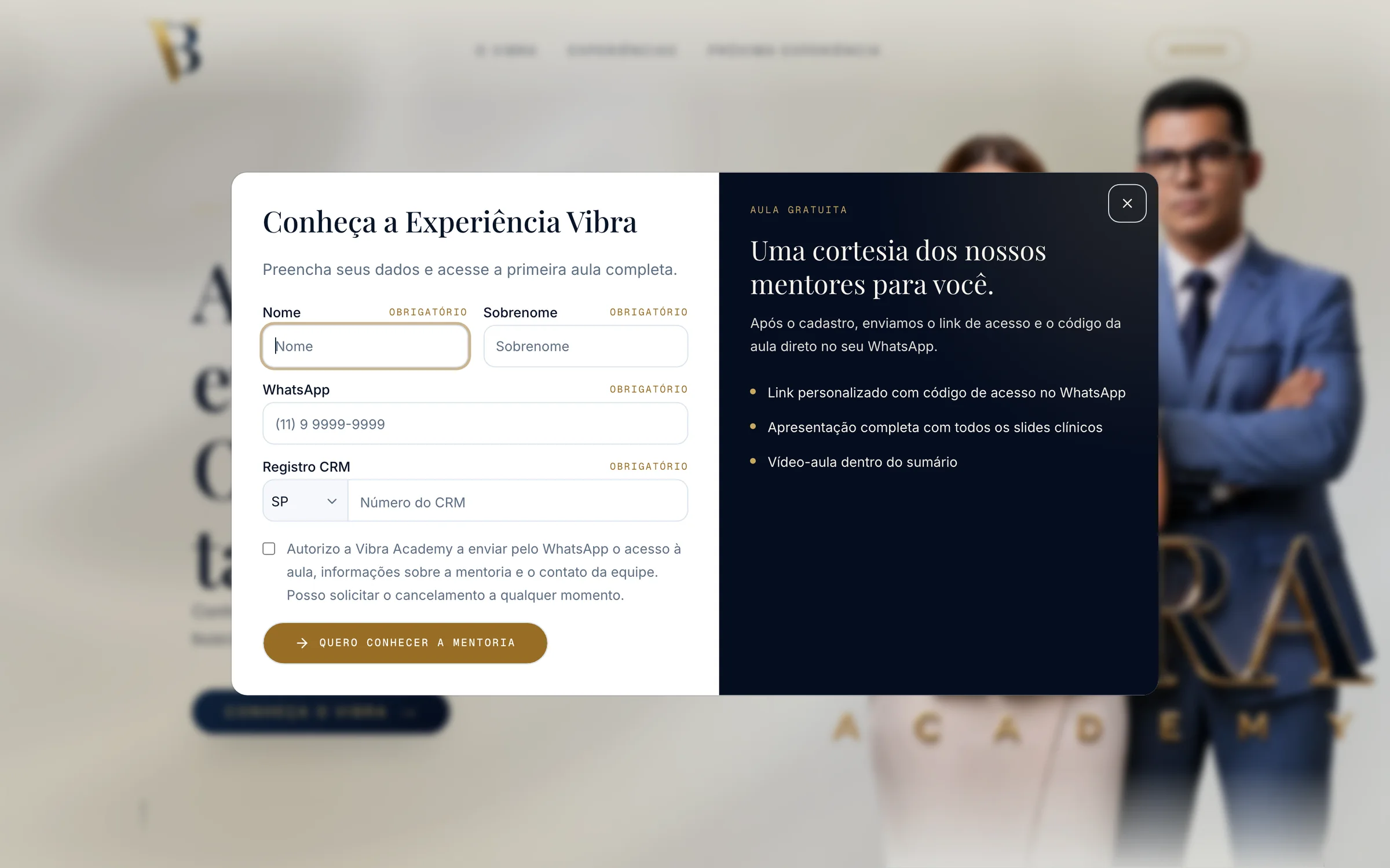
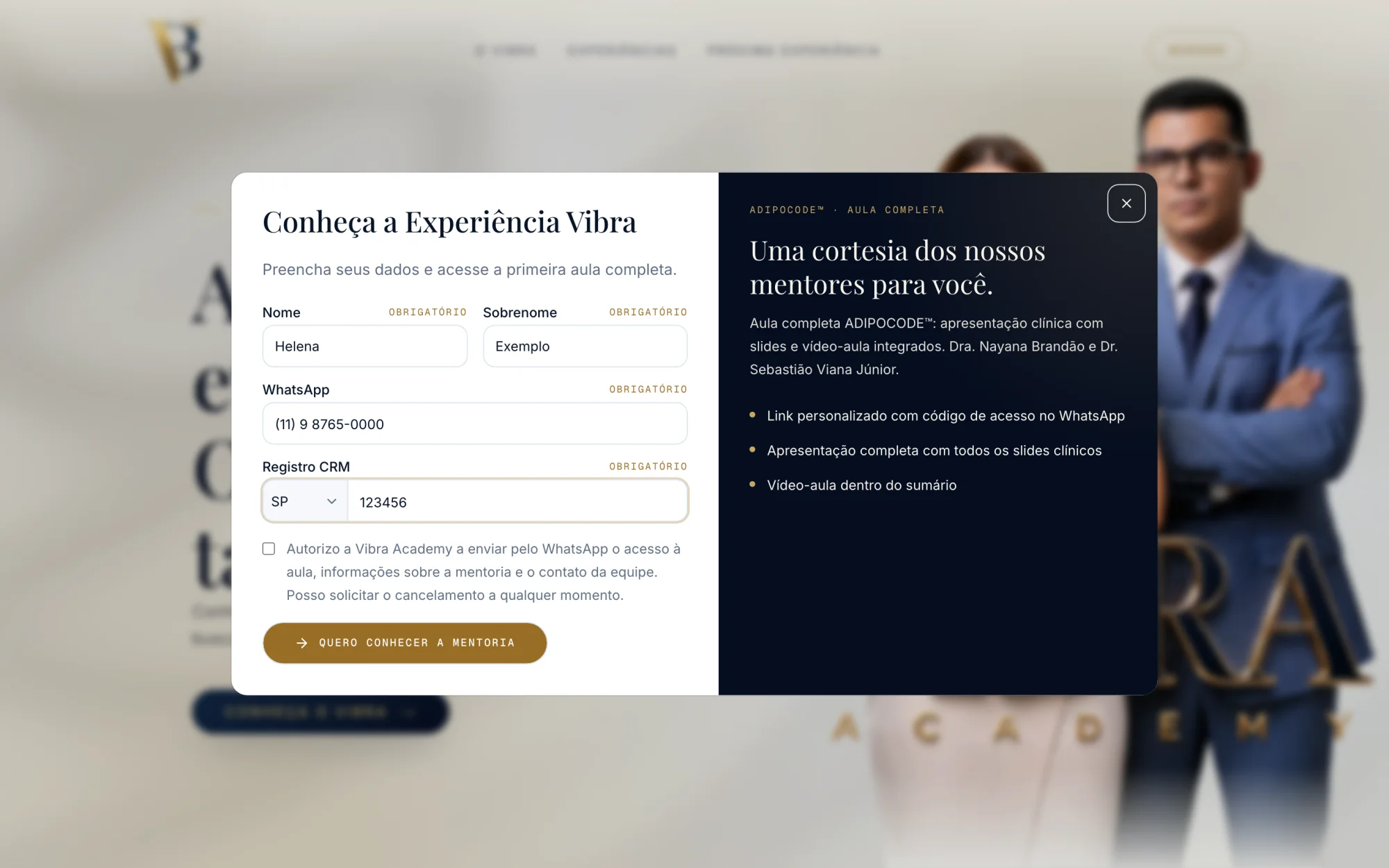
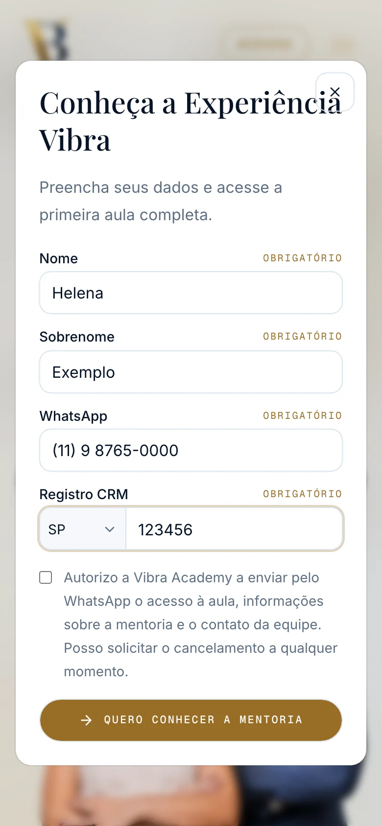
The site shows the next in-person immersion. A button there, or a QR code at the event itself, opens the same short form.
And a help center for the rest
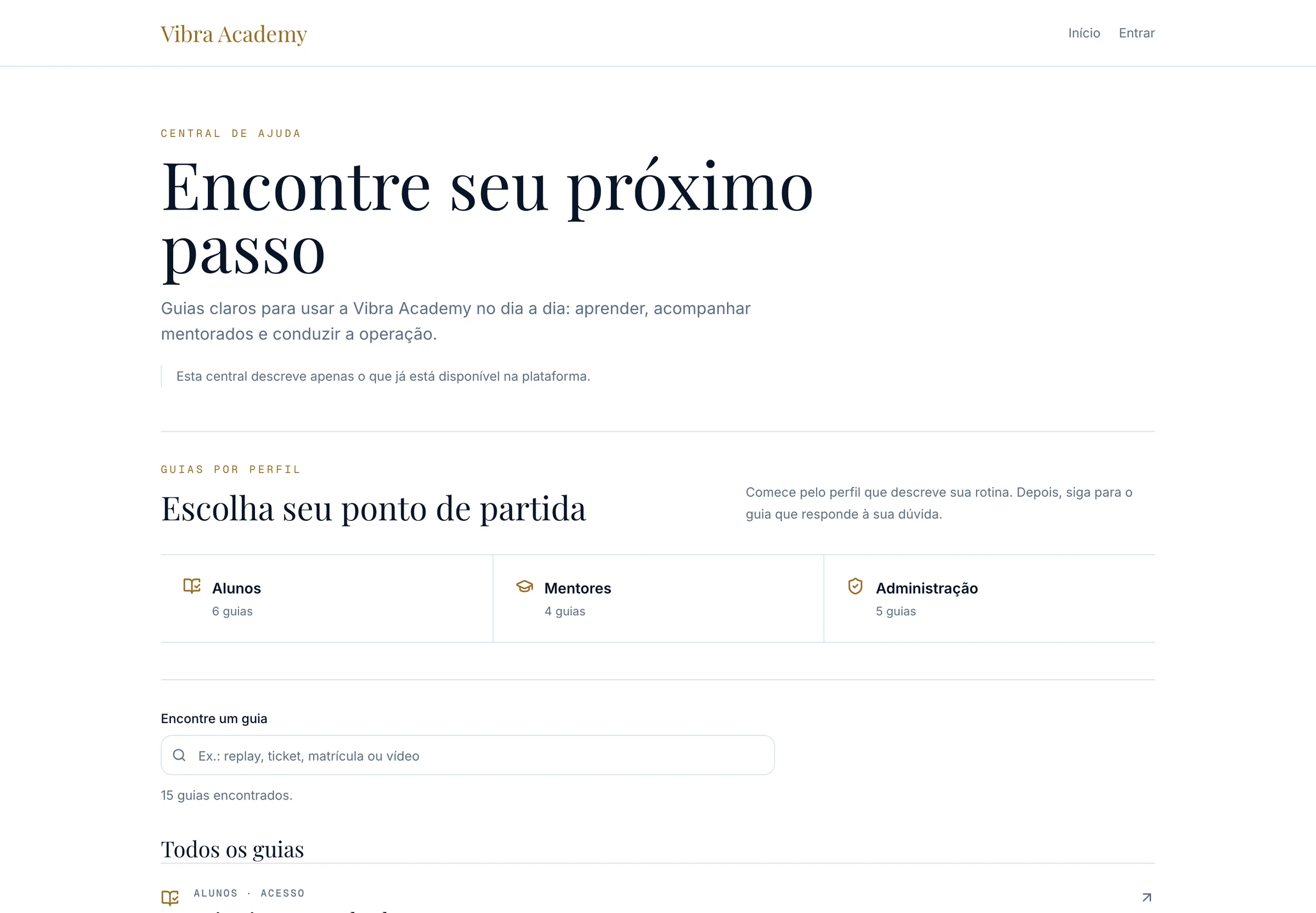
15 guides split by role: 6 for students, 4 for mentors and 5 for admins, with search. It describes only what the platform already does.
mentoria.vibra.academy/ajuda
A site with the academy’s presence
Recorded on the live site, top to bottom.
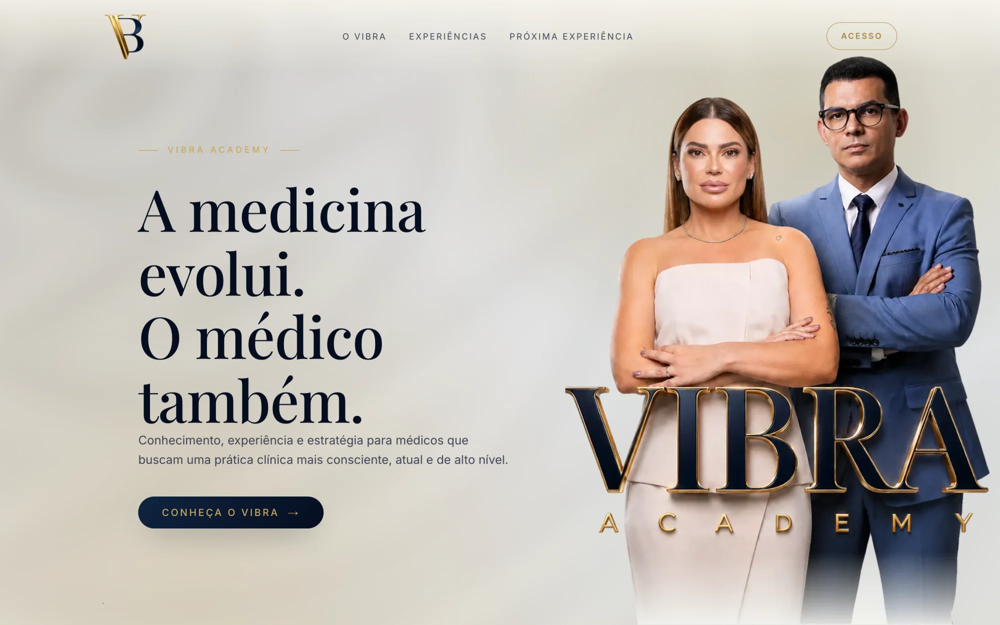
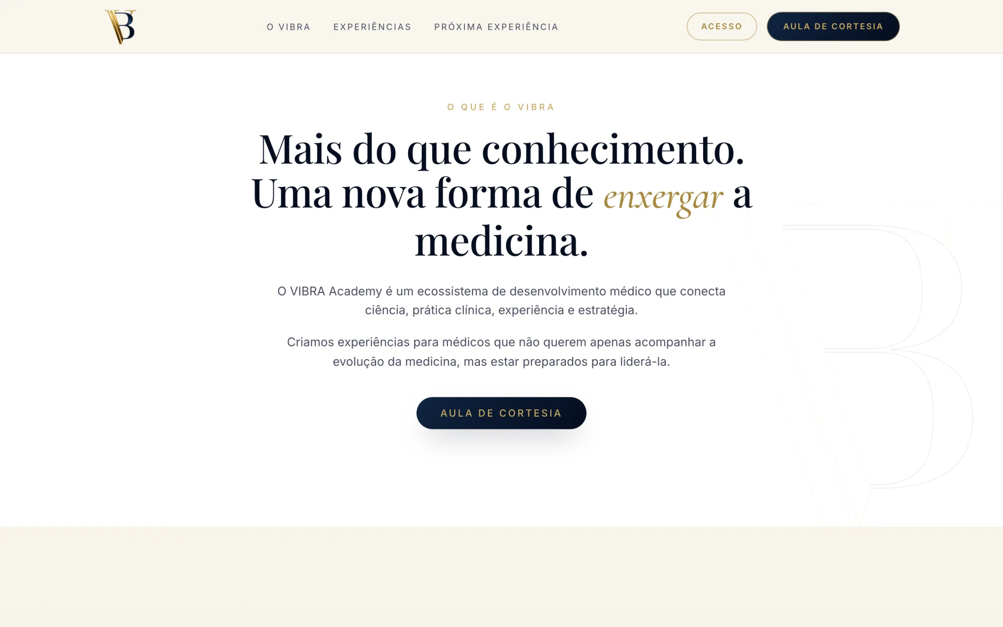
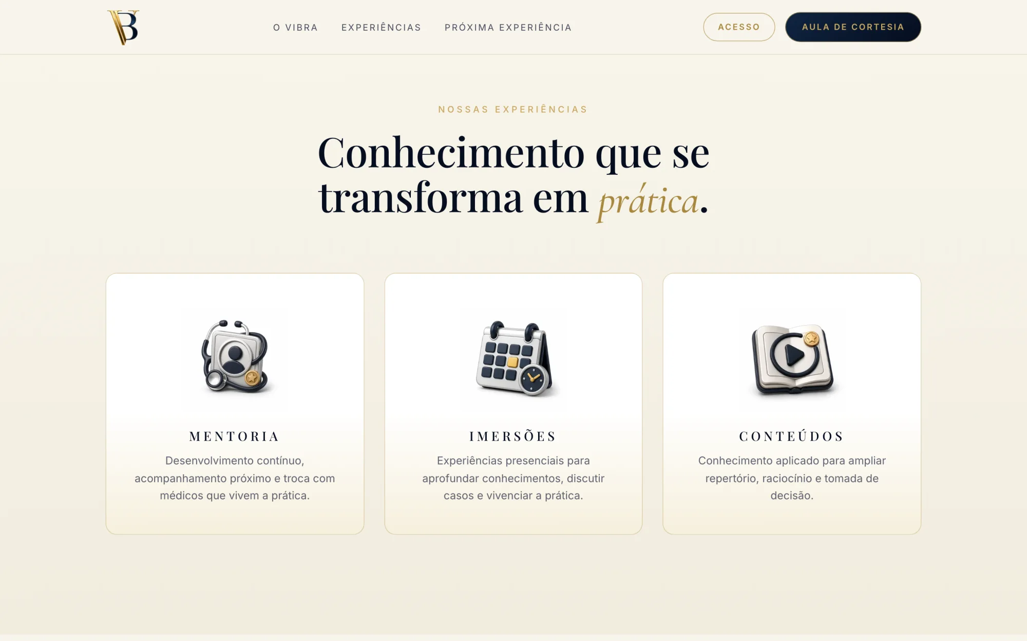
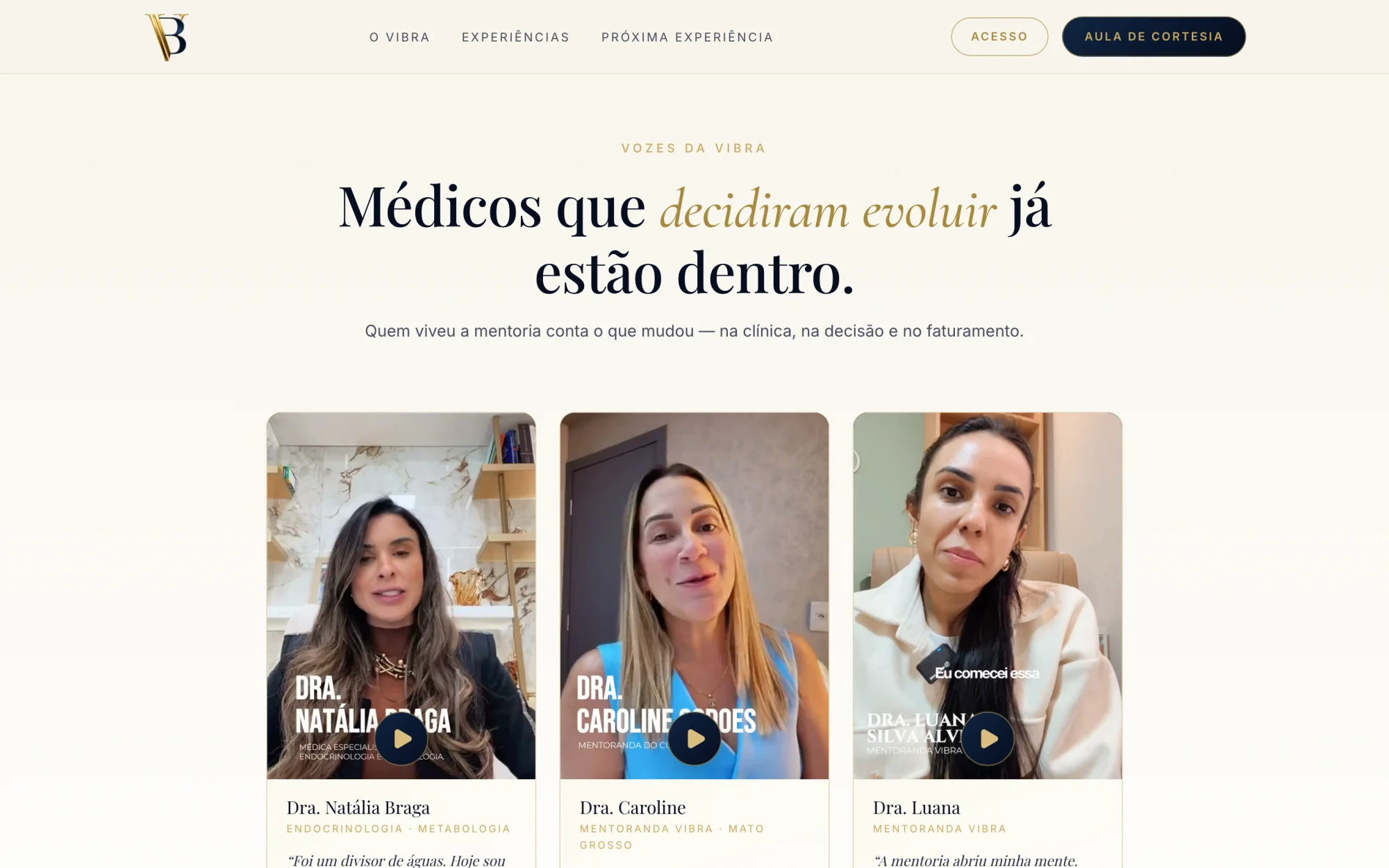
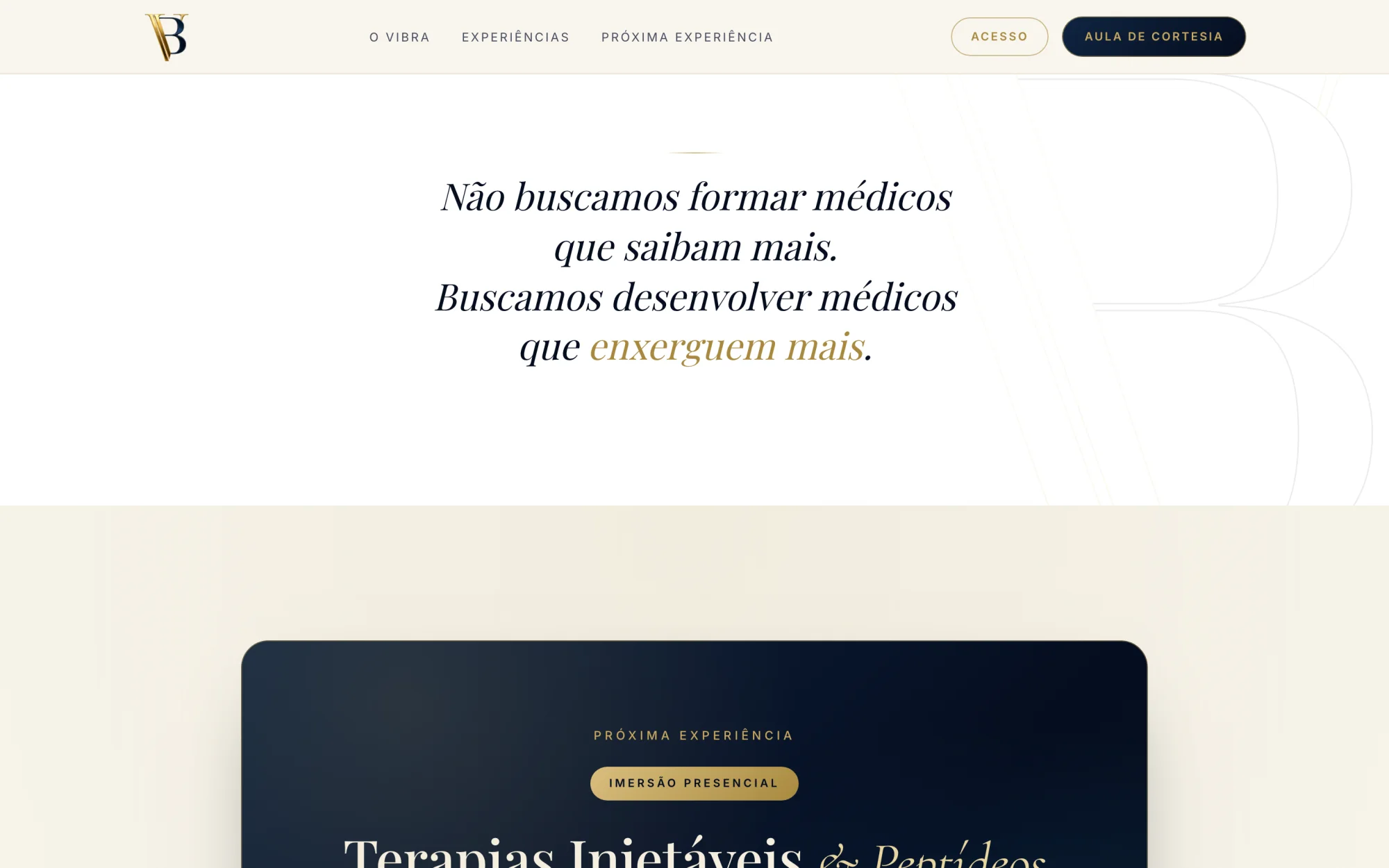
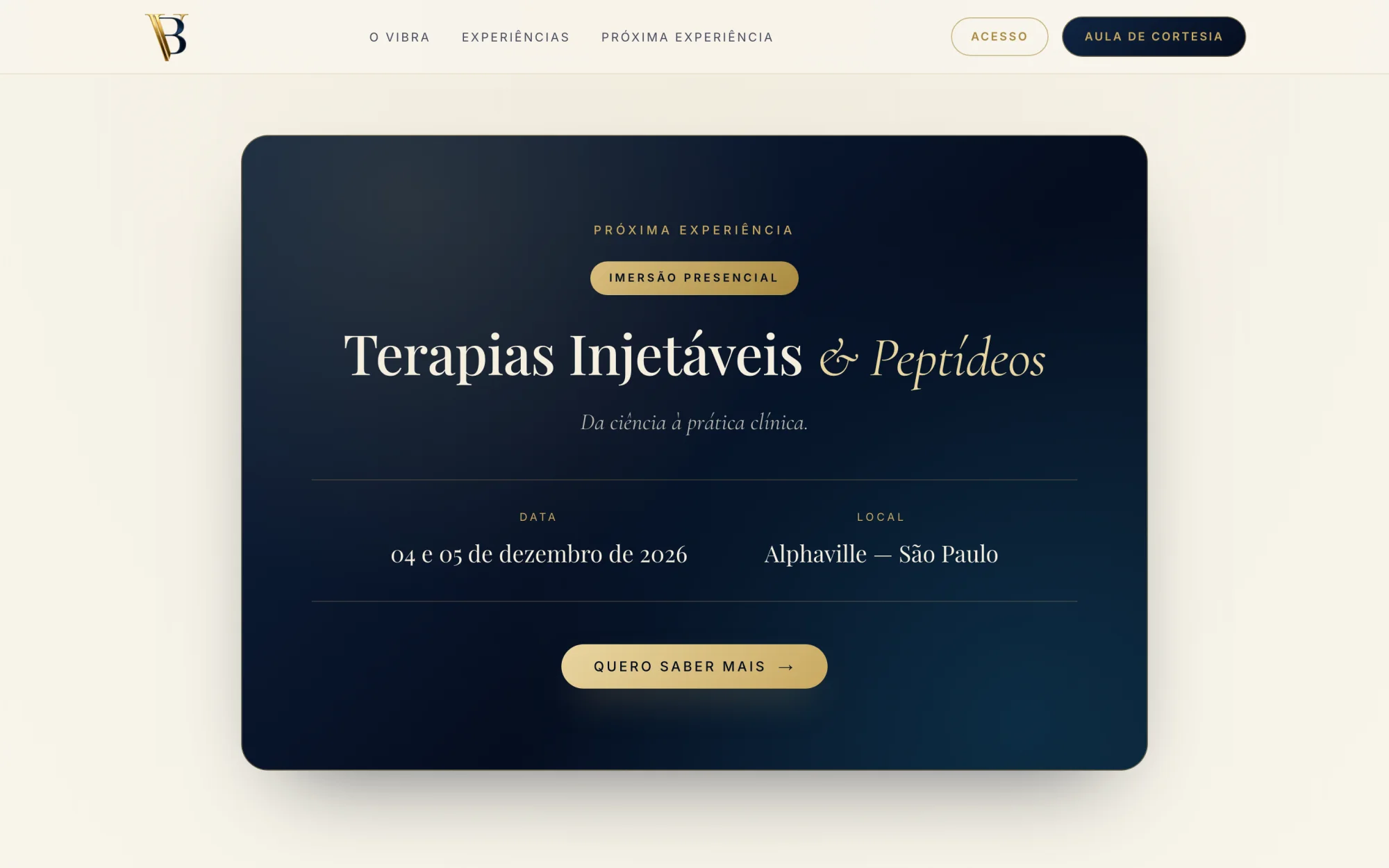
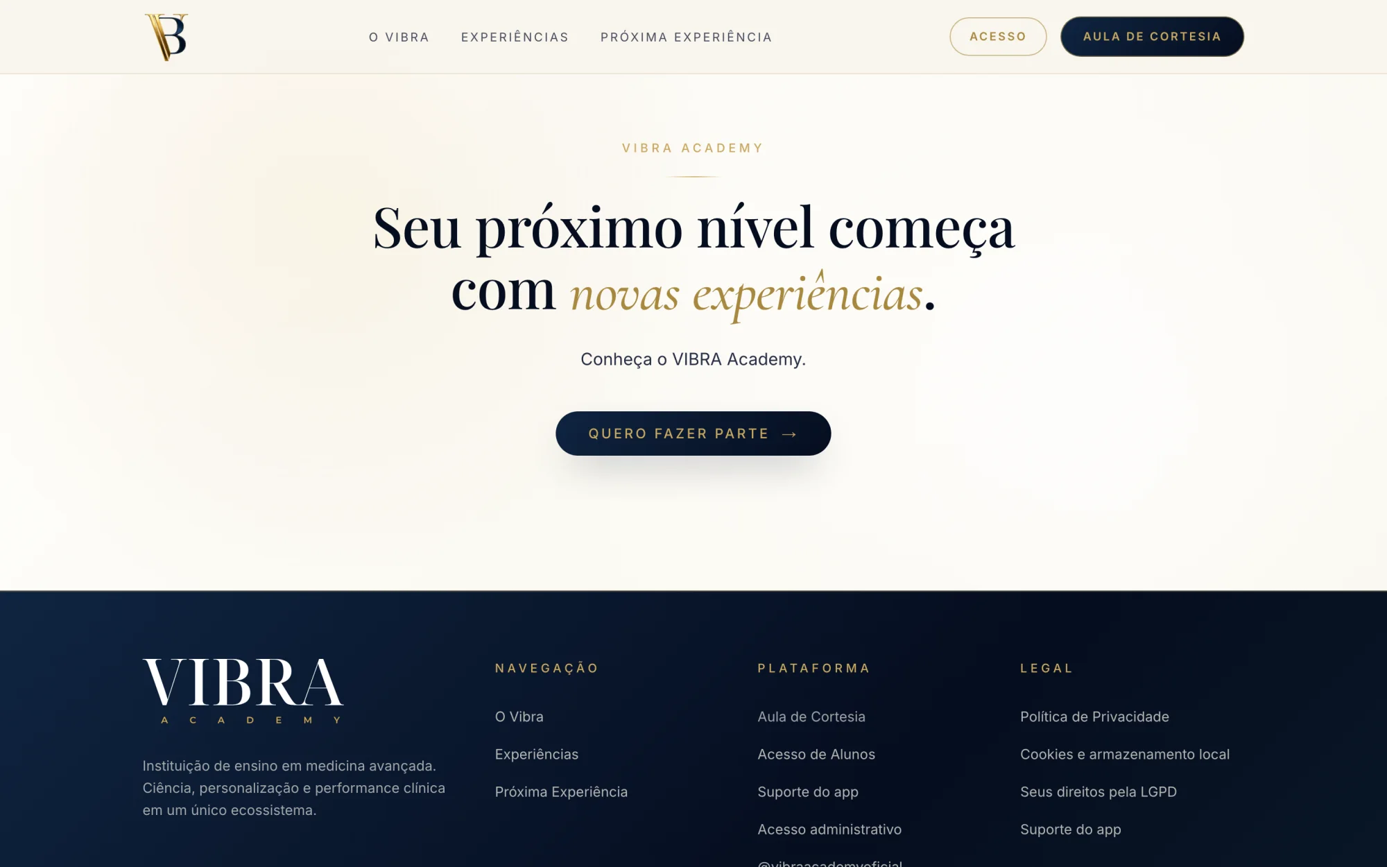
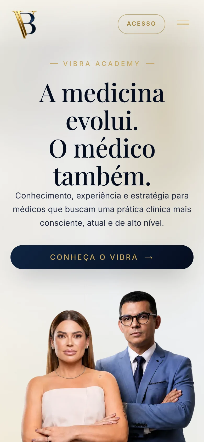
The hero
Two physicians beside the wordmark in gold, and one line on what the academy stands for.
Built for the phone first
A QR code at an event opens the site on a phone, so the phone layout was designed on its own: the hero keeps both physicians in frame, and the form fits one screen.
Outcomes & learnings
- WebsiteLive
- Learning platformLive
- iPhone appTestFlight, build 4
- A public site, a platform for three roles and a native iPhone app, designed and built by one person.
- Every lesson on one deck engine, opened by enrollment or an access code instead of a shared password.
- Questions, files and follow-up in one thread per subject, with notes the student never sees.
- One admin for people, cohorts, lessons and video, and a free-lesson path for leads met at events.
What I learned
Writing the parity rule down early kept web and iPhone in step: features land on both, with every state designed.
A spec is a starting point. Two decisions that shaped the product went against it.
The spec said
Email and password for staff, a four-digit code for students.
I chose
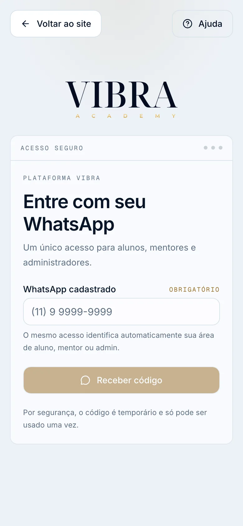
One WhatsApp sign-in with a six-digit code for every role, routed by role.
The live sign-in says it in one line: “Um único acesso para alunos, mentores e administradores.”
The spec said
A dark interface first.
I chose
A light interface: white surfaces, 1px borders, navy for structure and gold only for the next step.
The direction I set was precision, serenity and clinical sophistication. The dark tokens exist; the toggle is off.